
Figure 1.
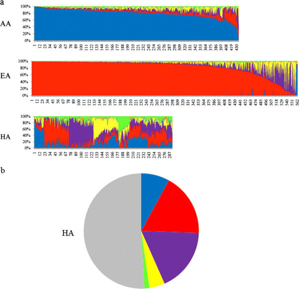
Individual admixture estimates and the distribution of the major ancestry contributions in the HA group. (a) Schematic representation of the individual admixture estimates using (K = 7). Each vertical line represents one individual, and subjects are displayed according to their predominant cluster contribution. The clusters correspond to the geographical regions based on the HGDP sample. Color code: Africa (blue), Europe (red), Middle East (purple), Central Asia (yellow), Far East Asia (cyan), Oceania (amber), and America (green). (b) The distribution of the major ancestry contributions (frequency > 0.5) in the HA group. Color code: no single major ancestry (gray); major ancestries: Europe (red), Middle East (purple), Africa (blue), Central Asia (yellow), and America (green).