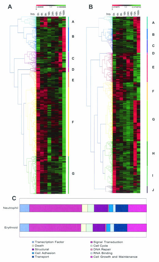
FIG. 4.
Analysis of differentially expressed genes in erythroid (A) and neutrophil (B) differentiation. The adjusted expression levels (mean = 0; variance = 1) at the indicated time points were hierarchically clustered by using uncentered Pearson correlation and average linkage clustering. The range of relative expression levels from lowest to highest is represented by the green and red shading, respectively. Colored bars along each graph highlight prominent gene clusters (A to G for erythrocytes and A to J for neutrophils) corresponding to the color-matched branches of the tree (45). (C) Bar charts showing the distribution of all differentially expressed genes according to function. Genes were annotated by using the Simplified Ontology tool in GeneSpring. It should be noted that this analysis is partially limited by the fact that annotations are available for only a subset of genes (>70%) represented on the genechip. Also, the criteria used to assign functional categories may result in nonredundant classification of genes (i.e., one gene may be assigned twice in different categories).

