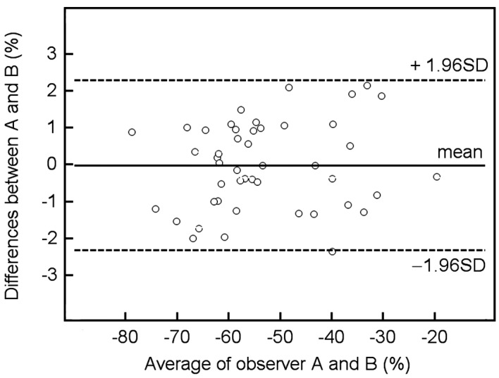
Figure 3.

Graph (Bland-Altman plot) displays a scatter diagram of the differences plotted against the average of the two independent observers' measurements of the reduction-%LMR on T2-weighted GRE image. Horizontal solid line is drawn at the mean difference and horizontal dotted lines are drawn at the mean differences ± 1.96 times the standard deviation (SD) of the differences.
