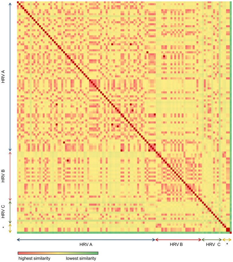
Figure 2. Heatmap of UpA odds ratio (midpoint 35).
The difference of the odds ratios between strains is depicted in colours. The colour range used shows highest similarity with red, with decreasing similarity moving to yellow and least similarity in green. Asterisc: outgrouping of viruses with high UpA suppression (methods).

