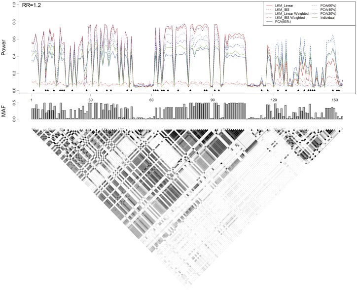
Figure 3. Power, the causal SNP and the genotyped SNPs in scenario B2 based on the ASAH1 gene.
The top plot shows the power (y-axis) of each method over the locations (x-axis) of the causal SNPs. The triangles in the plot are the locations of the genotyped SNPs. The bar-plot in the middle shows the MAFs of all SNPs. The bottom plot shows the LD structure of the 154 SNPs downloaded from the HapMap project.

