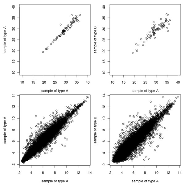
Figure 2.

qPCRpairsPlots.png. Plots of Cq values. The top row plots show the difference between the expression values for genes measured by RT-qPCR technology, between samples of the same sample-type (top left), and between different samples (top right). The bottom row plots show the same, but for genes measured using microarrays The difference in numbering on the different axes is due to the different type of data returned by the different technologies. Datasets used are from the ALL package (microarray data) and the example dataset available in the ReadqPCR package (RT-qPCR data).
