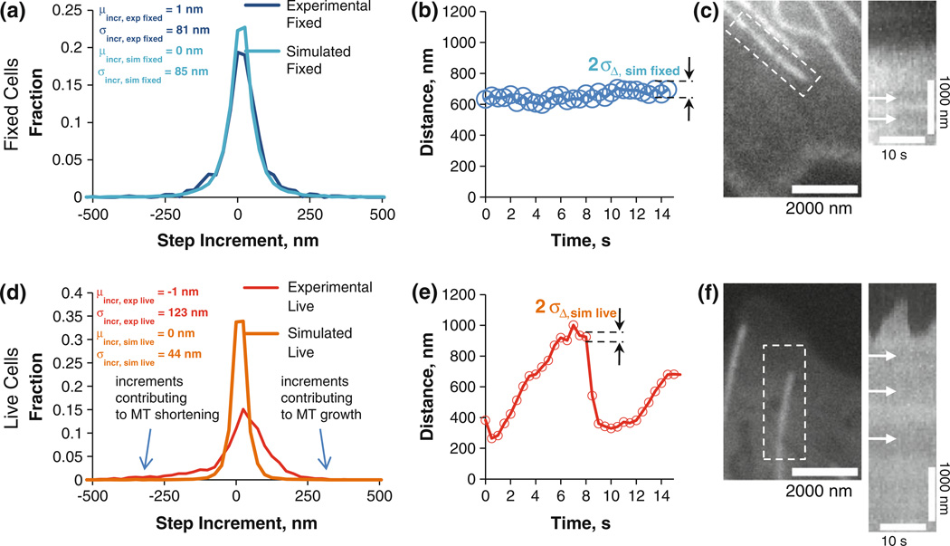
FIGURE 3. Method validation using fixed MTs and subsequent application to live MTs.
(a) Histogram of the step increments, dark blue plot showing the experimental fixed cell analysis, while light blue represents the simulated fixed cell data. The excellent agreement demonstrates that the simulation faithfully predicts the experimentally measured step increment distribution. (b) distance vs. time for the tip position. Circle diameter is equal to two times sD,sim fixed at each time point to demonstrate algorithm accuracy; (c) Fixed MT tip; kymograph of the fixed MT tip with arrows indicating speckles and lack of MT transport; (d–f) same as a–c, except for a live MT tip. Live MTs have increments (d, red) that are much more variable than expected from measurement error alone (d, orange).

