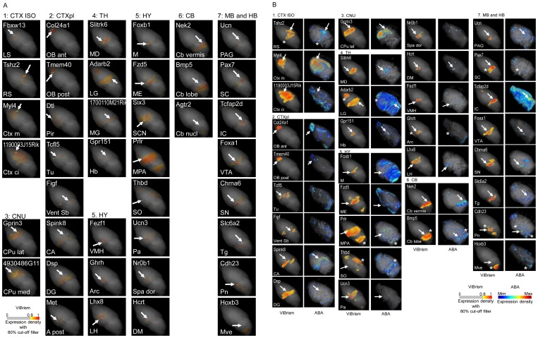
Figure 4. Validation of 3D expression maps.
(A) Comparison of 3D expression maps to B* area maps. 3D expression maps of 40 regionally expressed genes were chosen (Table S2). Corresponding B* area maps were overlaid on the expression maps and highlighted as 500 µm in diameters with VCAT. The names of the genes and the B* areas are shown at the top and the bottom of panels respectively. Spheres of the B* areas are indicated with arrows in the panels. If the gene expression areas indicated with yellow/orange/red colors are located in the B* areas, the colors are highlighted to be seen in the spheres (23 genes): otherwise, gray colors appear. In most latter cases, the gene expression areas were located close to the highlighted spheres, suggesting that the distances between the areas and the spheres were mainly caused by the resolution differences of two systems. All maps were viewed in the same angle to show the expression pattern differences. Color codes for are shown. (B) Comparison of 3D Expression maps to ABA maps. Among the 40 regionally expressed genes, 3D map data of 33 genes were available in ABA. Expression maps in ABA and our maps (ViBrism) were visualized with VCAT. The names of the gene and the B* area, in which the gene was selectively expressed, are shown at the top and the bottom of panels for ViBrism, respectively. B* areas are indicated with arrows in the maps of ViBrism in the same way as Figure 4A and are also indicated in the maps of ABA if the areas were visualized with high expression. Expression areas common in the two maps but outside the named B* areas are indicated with asterisks. All maps are shown in the same angle to show the expression pattern differences. Color codes for ABA and ViBrism are shown.

