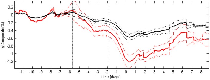
Figure 2. Average composite measure of variability.
In red are displayed the results of the composite; for comparison, in black are displayed the results of the detrended fluctuation analysis area under the curve, after admission condition normalization. The continuous lines represent the average value of the time series across the population, and the dashed lines represent plus or minus the standard error of the mean. The two vertical dotted lines highlight when, on average, the composite variability started to drop. Before averaging, for each of the 14 subjects developing sepsis the time series of either the composite or the detrended fluctuation analysis were aligned to the time of administration of antibiotics (t = 0). The picture shows the higher sensitivity of the composite to sepsis development, respect to the sensitivity of a single HRV measure.

