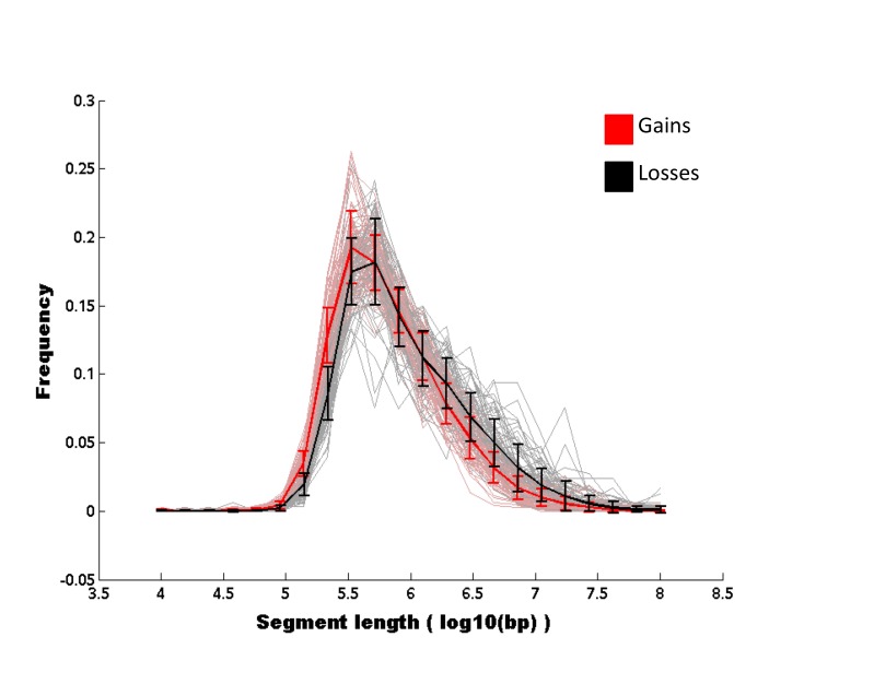
Figure 4.
Empirical distribution of genomic sizes of aberrant regions of gains and losses. For each sample in the cohort, we computed the distribution of genomic sizes of aberrant regions for gains (pink) and losses (gray). The gains mean and corresponding error bars are shown in red, the losses mean and corresponding error bars are shown in black. A gap is seen between the error bars of short copy number events, indicating that gains are more frequent than losses at that length-scale. However, losses are more frequent, although not significantly, at longer length-scales.

