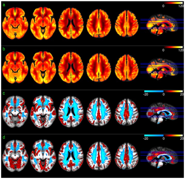
Figure 1. Group level CBF analysis results.
a) Mean CBF map of session 1, b) mean CBF map of session 2, c) CBF distribution map of session 1, and d) CBF distribution map of session 2. Red and blue in c) and d) mean higher than average CBF and lower than average CBF, respectively. c) and d) were thresholded with p<0.001 (uncorrected).

