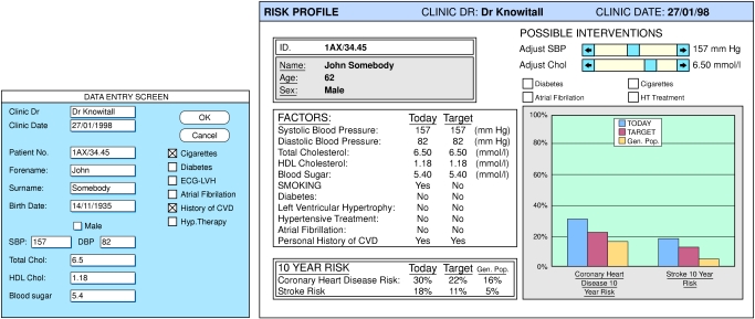
Figure 1.
Data entry screen (below) and individual risk profile (right). The graph shows predicted 10 year risk for coronary heart disease and stroke (blue columns); risk for an individual matched for age and sex with population mean levels, adjusted for age, of cholesterol and systolic blood pressure (yellow columns); and the effect of stopping smoking on risk (red columns)

