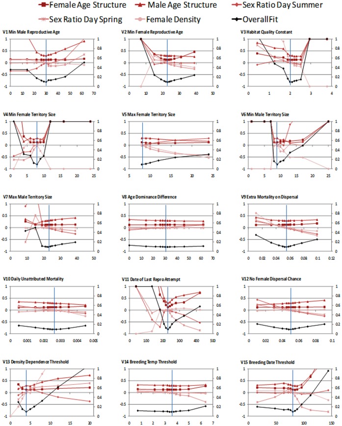
Figure 8. Graphs of sensitivity analysis for the 15 parameters tested.
Fits to density, sex ratios and age structure are shown as proportion deviation from target pattern. X-axis denotes the parameter values used in each case, and the vertical line the actual parameter value chosen following POM testing (see Table 1). Overall measure of fit (black line) is the mean deviance and is capped at 1.0. All graphs are scaled to ±1.0 for proportion deviance from real world patterns (left y-axis), and 0–1.0 for measure of fit (zero being perfect fit) (right y-axis).

