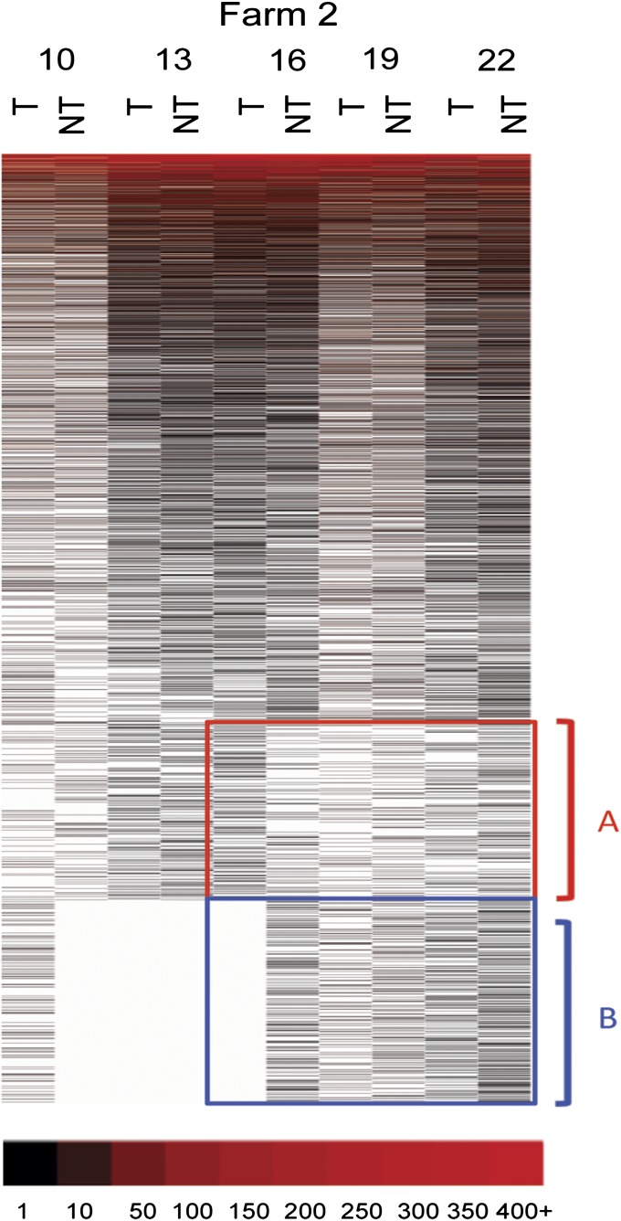
Fig. 4.
Distribution of OTUs in the two treatment groups in the farm 2. The heat map for the farm 2 was created using OTUs with an OTU definition at a similarity cutoff of 93%. Each column represents groups and each row indicates OTUs. OTUs were sorted with the most abundant OTUs displayed at the top and the least abundant OTUs at the bottom. T and NT indicate tylosin and no-tylosin group, respectively, and numbers indicates weeks of age. Abundant OTUs were red color-coded and white blanks indicate missing OTUs.

