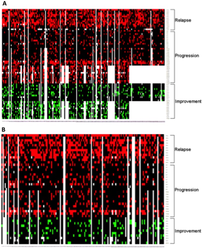
Figure 1. Heat map display of disease activity at the individual level.
The heat maps have patients on columns, and outcome measures on rows. Red indicates intermittent activity or progression, green indicates improvement, black indicates no change, and white indicates missing value. The data are from 2-year studies in SPMS (panel A) and PPMS (panel B) subjects randomized to placebo in the IMPACT [8] and OLYMPUS [9] multicenter clinical trials. All calculations were performed based on the definitions listed in Table 1. Notice that progression was most often detected using definition 2 with the T25FW and the 9HP.

