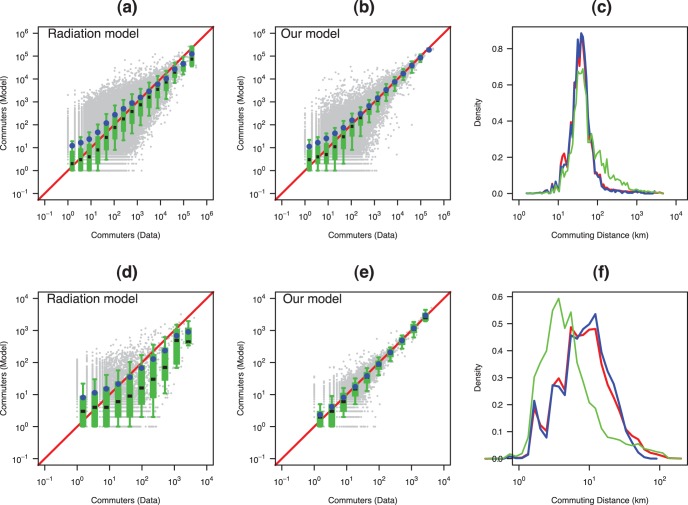
Figure 5. Comparing the predictions of the radiation model with ours for two case studies, the first row ((a)–(c)) for  (USA at county scale) and the second row ((d)–(f)) for
  (Auvergne region, France at municipality scale).
Plots (a), (b), (d) and (e): Comparison between the observed (Census) and the simulated (model) non-zero flows. Grey points are the scatter plot for each pair of units. The boxplots (D1, Q1, Q2, Q3 and D9) represent the distribution of the number of simulated travelers in different bins of number of observed travelers. The blue circles represent the average number of simulated travelers in the different bins. Plots (c) and (f): Commuting distance distributions (km) (i.e. Probability for a commuters of the region to commut at a distance  ). The blue line represents the observed data, the red one the results of our model and the green one the results of the radiation model.

