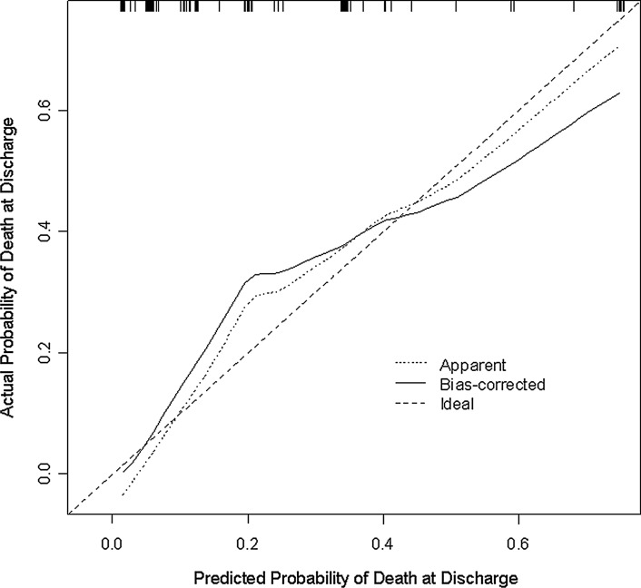
FIG. 1.
Calibration of nomogram. This diagram illustrates how far the predictions are from the actual risk of death. The x-axis shows the predicted probability of death at discharge based on the logistic regression model. The y-axis represents the actual probability of death at discharge, which is calculated by (1) dividing patients into subgroups according to their predicted probability of death at discharge in ascending order and then (2) determining the proportion of actual death at discharge for each subgroup. There are two predicted curves in the figure—apparent and bias corrected. The apparent method assesses the performance of the logistic regression model using the same data that were fit to the model, whereas bias-corrected uses data generated from 500 bootstrap samples and is used to estimate how well the model will perform for future data. Perfect calibration would result in both curves falling on the 45-degree line.

