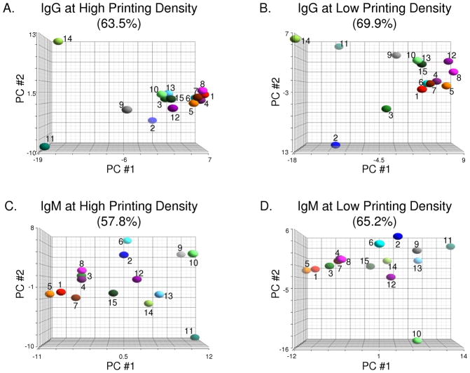
Figure 4.
Principal Component Analysis (PCA) of Sera from Healthy Subjects. PCA provides a graphical overview of similarities and differences among serum antibody profiles of 15 healthy subjects. Analyses of IgG antibodies on high and low density antigen arrays are shown in panels A and B, respectively. Similarly, binding of IgM antibodies was also measured on high (C) and low (D) density antigen arrays. Graphs were generated by projecting array data onto the top three principal components (PC) that account for the most variation between samples for each experiment. Percentage values above each graph indicate the amount of variation between samples represented by the top three PCs.

