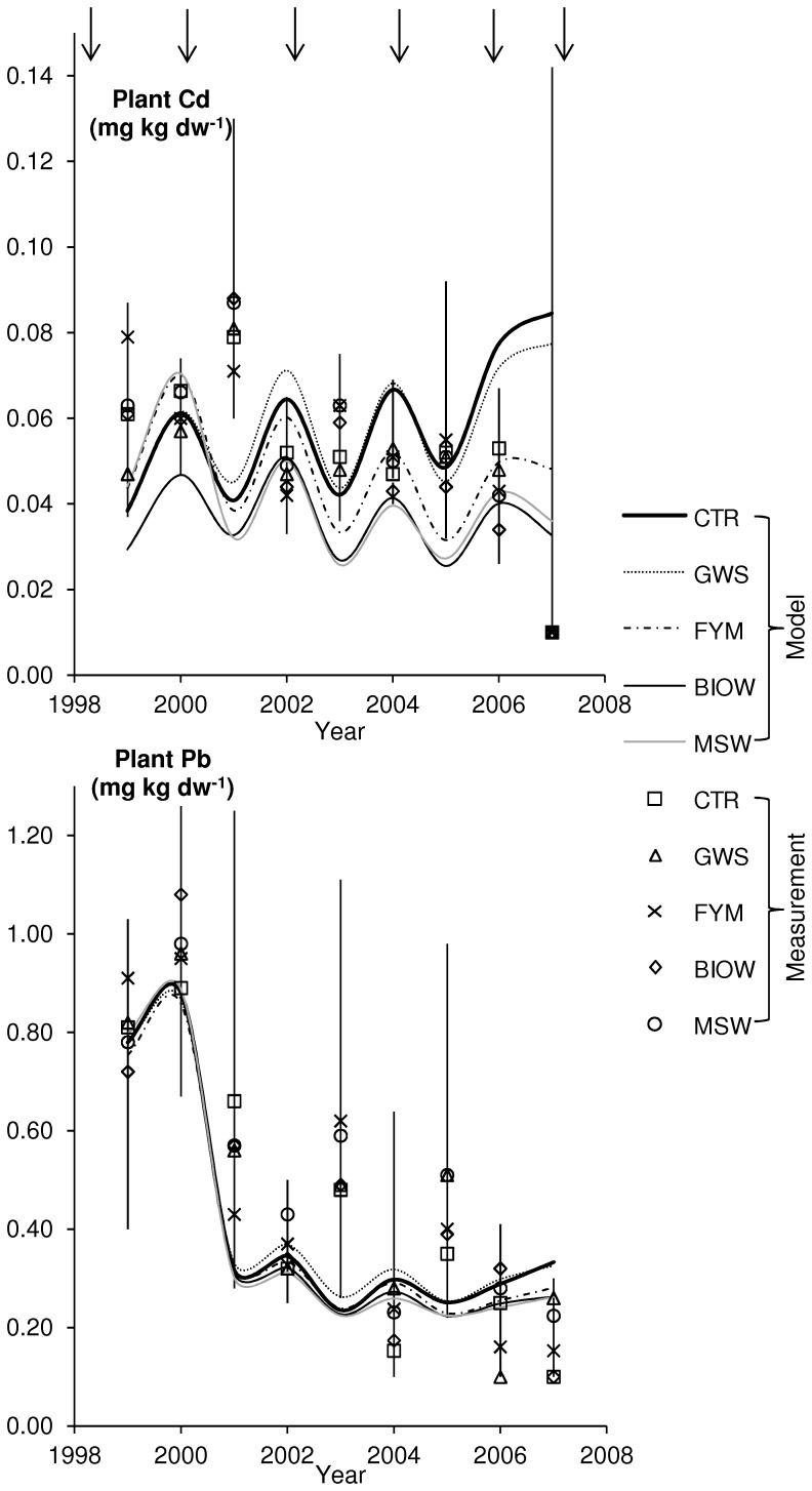
Figure 3. Comparison of predicted and measured concentrations in plants (mg kg dw−1) for the five treatments.
October 1999 to July 2007. Model predictions are connected by lines for clearer comparison to measured values. Vertical lines denote the range of measured values and symbols the medians of the four replicates (values below QL were set equal to ½ QL (note that QLs from 1999–2005 were applied for all years). Top arrows recall the time of amendment application.

