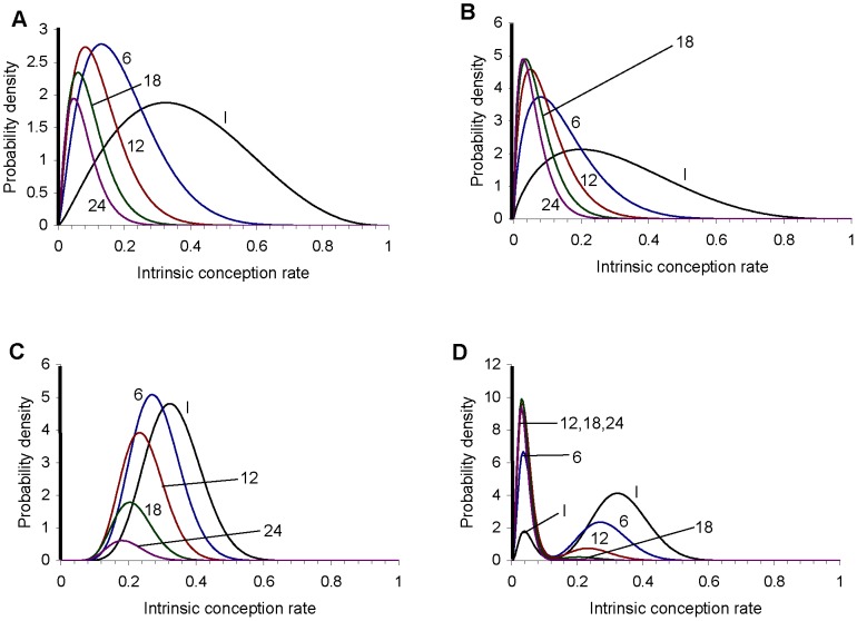
Figure 2. Distribution of the intrinsic conception rate for examples 1 to 4: (A) example 1, (B) example 2, (C) example 3, (D) example 4.
In each panel the plot labelled I shows the initial (prior) distribution. The other plots show the distribution conditional on non-conception after 6, 12, 18 and 24 cycles. A thick line represents the finite proportion of the population with an intrinsic conception rate of zero. (This is intended as a schematic representation: the thickness of the line is not proportional to the proportion of couples who are sterile.) The total area underneath each curve corresponds to the proportion of the remaining population which is not sterile: this decreases with the number of cycles as the proportion of the remaining population who are sterile increases (see first column of tables 2, 3, 4, and 5). For example 4, the part of the distribution representing the low fertility segment of the population (i.e. with an intrinsic conception rate below about 0.12) changes little as the number of cycles of non-conception increases from 12 to 24, while the proportion of the remaining population in the higher fertility segment (i.e. with an intrinsic conception rate above about 0.12) is very low after 18 cycles and negligible after 24 cycles.

