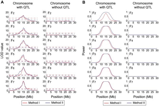
Figure 1. Evaluating the power of QTL mapping by simulations.
a The distributions of the LOD values at markers along chromosomes (left: the chromosome with the QTL, right: a chromosome representing the other chromosomes without the QTL). The QTL is located at the middle of the chromosome (left panel). The red and blue lines show the LOD scores of Method I and Method II, respectively. The result is from a single replication of the simulation with  = 200,
  = 0, and
  = 2. The 5% cutoff values for the two methods are shown by broken lines. b The distributions of the power of the two methods, which were obtained by 10,000 replications.

