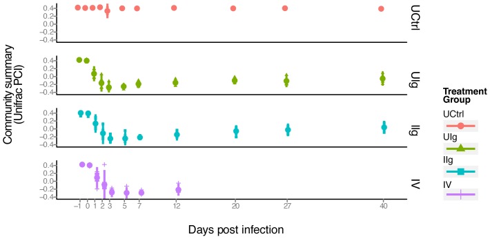
Figure 5. PCoA analysis displaying the community structure through clindamycin treatment and recovery.
The x-axis indicates time, the y-axis indicates the value of the first principal coordinate, a summary of the UniFrac matrix of distances between bacterial communities. The color code for the different groups is shown to the lower right. Each point represents the community of one animal on one day and the large colored dot on each day is the mean. Red dots- untreated control group; green triangles- UIg; teal squares- IIg; purple plus signs- IV. Vertical bar- range of two standard deviations from the mean.

