
Figure 5.
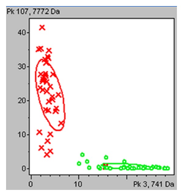
Two-dimensional peak distribution view of the two peaks selected for the diagnostic model. The peak area and the m/z values are indicated on the x- and y-axes. The ellipses represent the standard deviation of the class average of the peak areas/intensities. Red represents colorectal cancer patients and green represents healthy volunteers.