
Figure 3.
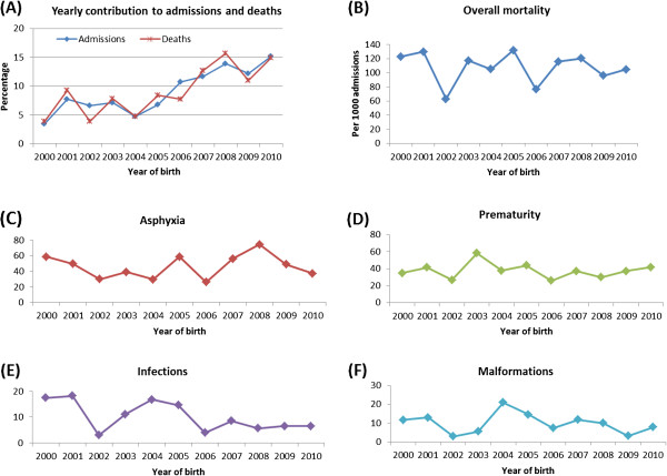
Graphs showing percentage contribution to overall admissions and overall deaths for each year (A), trend in death rate per 1000 admissions according to year of birth for overall (B) and in each category of cause-specific of deaths (C-F).
Official websites use .gov
A
.gov website belongs to an official
government organization in the United States.
Secure .gov websites use HTTPS
A lock (
) or https:// means you've safely
connected to the .gov website. Share sensitive
information only on official, secure websites.
Graphs showing percentage contribution to overall admissions and overall deaths for each year (A), trend in death rate per 1000 admissions according to year of birth for overall (B) and in each category of cause-specific of deaths (C-F).