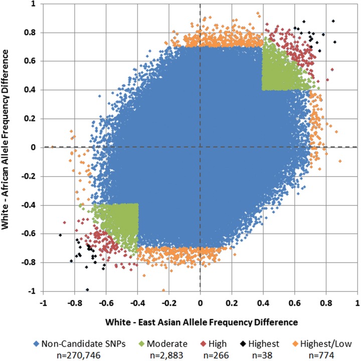
Figure 3.
White vs. African and White vs. East Asian allele frequency differences and selected candidate SNPs. Each SNP is plotted by its allele frequency difference between Whites and Africans vs. its allele frequency difference between Whites and East Asians. Green SNPs in the upper-right and lower-left quadrants represent those with mean allele frequency differences of 0.40 to <0.60 (Moderate), red SNPs represent those with mean allele frequency differences of 0.60 to <0.70 (High), and black SNPs represent those with mean allele frequency differences ≥0.70 (Highest). Orange SNPs around the perimeter represent those in which the allele frequency difference was at least 0.70 in one comparison, but less than 0.40 in the other (Highest/Low).

