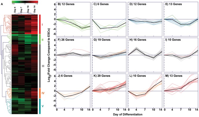
Figure 3. K-means clustering of combined array sets.
(A) The hierarchical cluster produced by merging data from both the ECM and growth factor arrays exhibits several identifiable clusters, indicated by groups I–V. (B–M) K-means clustering of the combined data set highlights the subtle temporal changes in gene expression while clustering genes that follow similar patterns of expression over time. In the k-means graphs, the x-axis at zero represents the undifferentiated ESC baseline. The centroid of each cluster is indicated by a black line (Figure 3B–M), while colored lines in each panel correspond to genes in the color-coded groups (I–V) established by hierarchical clustering (A).

