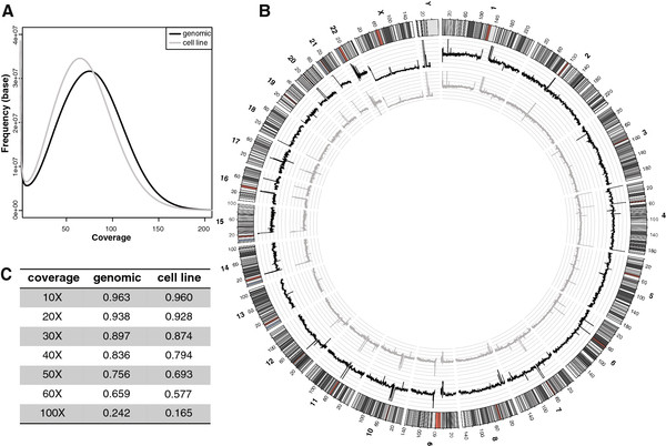
Figure 1.
Coverage of the two genomes. A: Number of reads is plotted against the number of bases for which that number of reads was observed. The proportion of reads with a higher coverage (more reads) is slightly higher for the genomic DNA (black line) than for the cell line (grey line). B: Proportions of the two genomes at a certain X coverage. C: Regional plot of averaged normalized coverages of the genomic DNA (black line) and the cell line (grey line). The axes are spaced in increments of 10.

