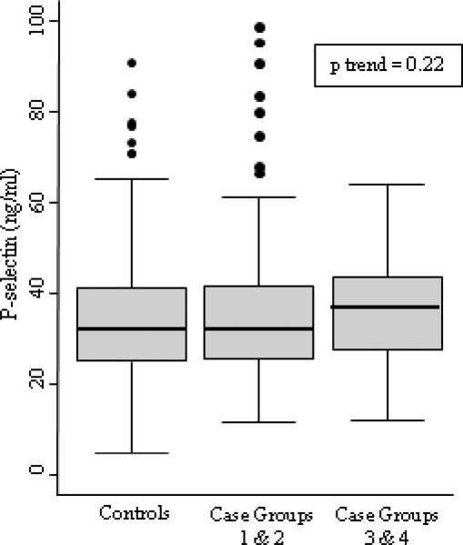
Figure 1.
Box plots showing the distribution of P-selectin levels for controls and cases. The center line of the box is the median, the outside edges are the 25th and 75th percentile, and the whiskers extend 1.5 times the interquartile range from the 25th and 75th percentiles. Observations outside the whiskers are represented by dots. The test for trend p value is included for the three categories represented in the figure.

