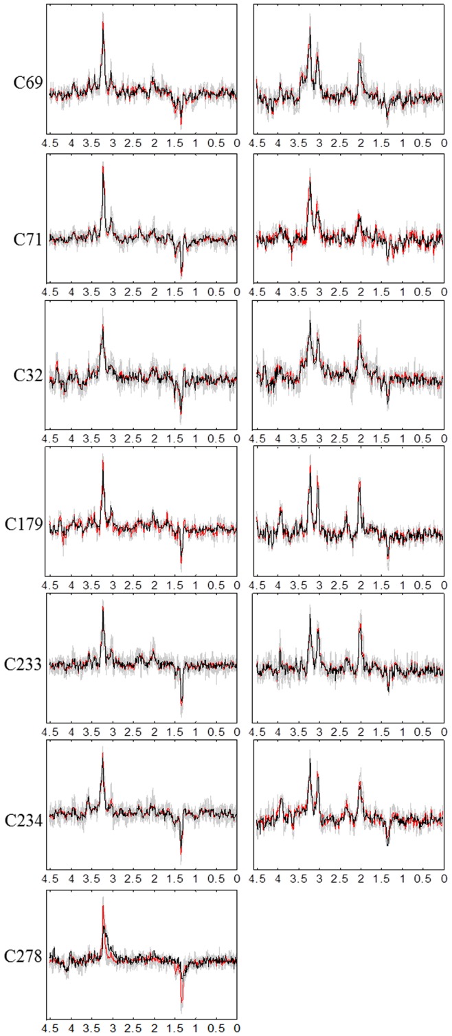
Figure 2. Sources obtained for the seven mice at LTE.
The calculated sources are shown in black color, the average spectra in red, and all the labeled spectra in gray. The sources in the left column represent the tumor, and the ones in the right column mainly represent non-tumoral tissue. Frequencies in the horizontal axis are measured in ppm.

