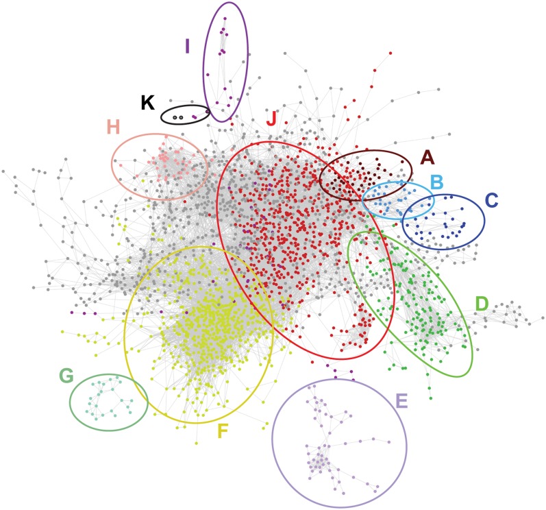
Figure 7.
The Pearson Correlation Network Based on the Abundance Profiles of Transcripts and Metabolites in Mutants and WT24cm.
Each node (dot) represents a probe or a metabolite. Each edge (line) represents a positive or negative correlation between the linked pair of nodes. The network is visualized with the organic layout in Cytoscape (Shannon et al., 2003), so that highly interconnected groups of nodes (that might be considered as subnetworks) are located in the same region. Nodes with the same color belong to the same subnetwork, according to HCCA clustering (Mutwil et al., 2010), and have a significant enrichment for certain GO classes (according to BiNGO) (Maere et al., 2005).

