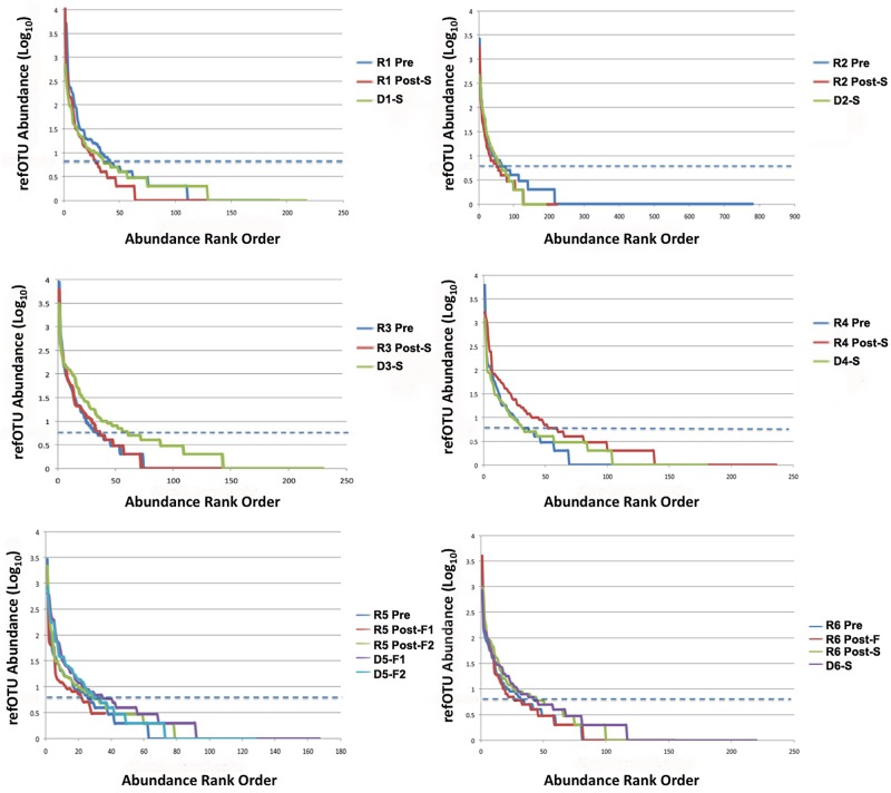
FIG 1.
Rank abundance curve comparison of refOTUs for all donors and recipients pre- and post-FT. Abundance has been shown in log scale on the y axis, and the rank order of the refOTUs is shown on the x axis. The dashed blue line corresponds (99% detection) to an abundance of 5. Summary statistics are tabulated in Table S1 in the supplemental material. D#-S, donor of successful transplant; D#-F, donor of failed transplant; R# Pre, recipient pre-FT; R# Post-S, recipient post-successful FT.

