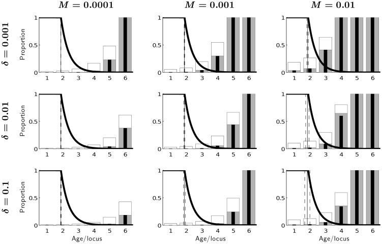
Figure 3. Equlibrium frequencies of mutations at different loci for background mortality µe = 0.01 under different mutation rates M and different effects of mutations on mortality δ.
Thin black bars: equilibrium frequencies of mutations for the asexual model, thick grey bars: equilibrium frequencies of recessive mutated homozygotes for the sexual model (see Fig. 1, Phenotype), empty bars: equilibrium frequencies of recessive mutated alleles at different loci for the sexual model (see Tab. 1). The vertical lines represent mean optimal age at maturity (solid) with standard deviation (dashed). The thick solid line captures the fraction of remaining reproduction, which is similar to Hamilton’s force of selection [16].

