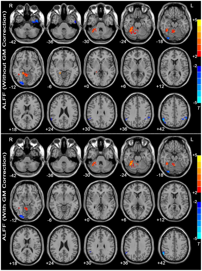
Figure 1. T-statistic maps of ALFF between MDD patients and healthy controls.
The threshold was set at P<0.05 (corrected). T-score bars are shown at right. Warm colors indicate increased ALFF in the MDD patients compared with the controls, and cold colors indicate the opposite. The numbers at the bottom left of the images refer to the z-coordinates in the standard space of the MNI template. The upper map depicts the results without GM correction. The lower map shows the results with GM correction. Details are provided in Table S1.

