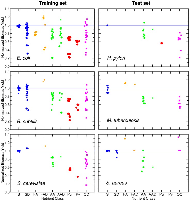
Figure 7. Normalized biomass yield for nutrient classes.
The panels show the normalized biomass yield  of G nutrients for species in the training set (left) and in the test set (right). Nutrients are grouped by their nutrient class (with positions in the X axis staggered so as to allow one to see all of them). The blue line represents
  for all the sugars uptaken by species s. The symbols for complex nutrients are enlarged.

