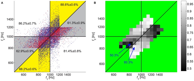
Figure 2. Performance of participants in Experiment 1.
A. Pattern of responses. Each dot corresponds to one trial of one participant, where the axes denote the frequencies of the 2 tones in the trial: the abscissa is the frequency of the 1st tone,  , and the ordinate is the frequency of the 2nd tone,
  , both on a logarithmic scale. The color of the dot denotes the outcome of the trial: correct responses are denoted by blue and incorrect responses by red. The vertical and horizontal lines correspond to the lines in which
  and
and  , respectively. The diagonal line corresponds to the line in which
  . These lines partition the
  space into different regions, denoted using a different background color. The numbers in each region denote the fraction of correct responses in the region ± SEM. Note that the pattern of correct responses is not symmetrical with respect to the diagonal, as expected from a participant whose probability of success in the trial depends solely on the ratio of the two frequencies. B. A two-dimensional histogram of performance rate, computed by binning the data presented in A and computing the fraction of correct responses in each bin. Bins in which the number of trials was smaller than 50 were not analyzed and are colored green. Note in particular the 2 squares marked by arrows. Although they are of equal ‘objective’ difficulty (they are located at the same distance from the diagonal), performance differed substantially: in the square denoted by the upper arrow performance was at chance level (50.8% correct responses) whereas in the square denoted by the lower arrow it was 92.3%.

