Figure 3.

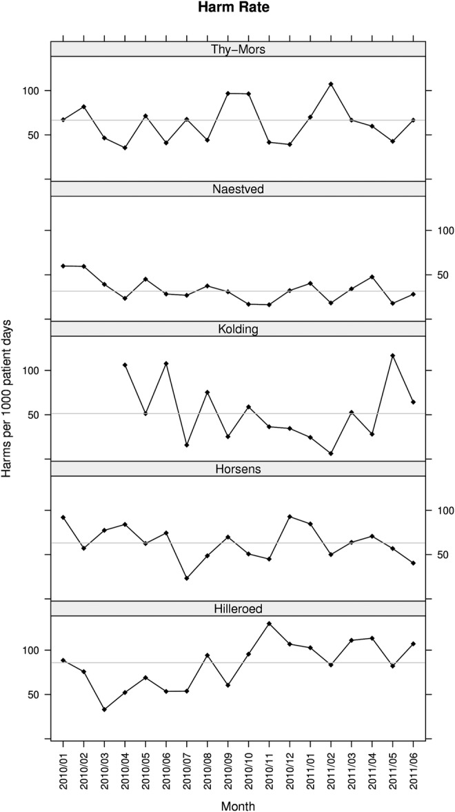
Rates of harm. The run charts show monthly rates of harms measured with the global trigger tool. The curve shows the harm rate expressed as the number of adverse events per 1000 patient-days. The horizontal line is the median harm rate.

Rates of harm. The run charts show monthly rates of harms measured with the global trigger tool. The curve shows the harm rate expressed as the number of adverse events per 1000 patient-days. The horizontal line is the median harm rate.