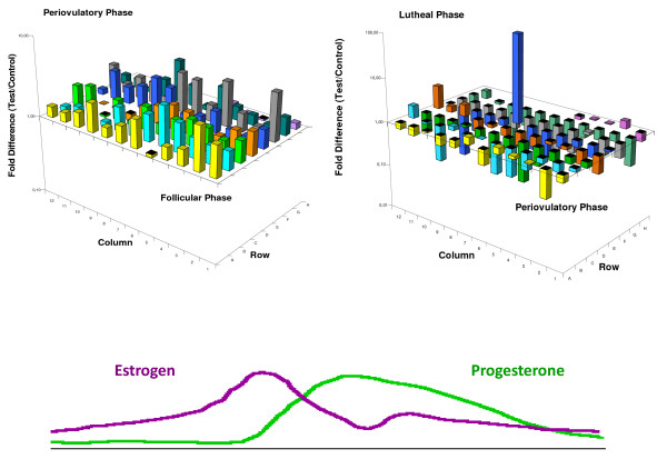
Figure 1.
Three-dimensional graph representing the gene expression levels in the PCR array plate. The axes x and y are the coordinates that identify the genes and the Z axis represents the individual gene expression levels after comparing the follicular phase versus periovulatory phase (panel 1A) and the periovulatory phase versus the luteal phase (panel 1B). In both cases B2M, HPRT1 and RPL13A were use as normalizing agents. The color lines represent the estradiol and progesterone levels throughout the menstrual cycle.

