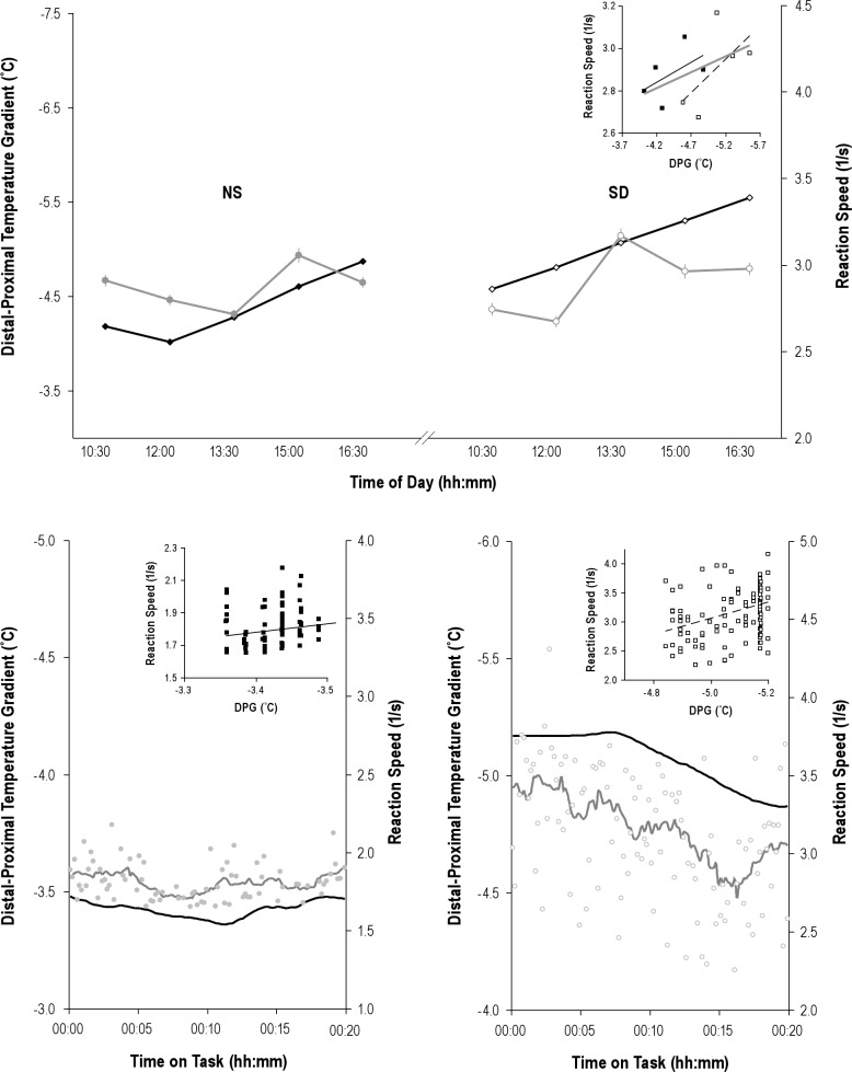
Figure 4.
Examples of associated upper distal to proximal gradients (DPGup) and reaction speed fluctuations. Top panel: mean ± standard error of DPGup (black line) and reaction speed (gray line) fluctuations for the five assessment blocks after normal sleep (NS, left side) and after sleep deprivation (SD, right side) in a single particpant. Note that all plots use an inverse scale, from maximal to minimal, for the DPGup axis, to better visualize its association with reaction speed. Also, in all plots, closed markers indicate data obtained after NS, open markers indicate data points obtained after SD. The inset scatterplot shows the association between the block averages, with regression lines for data obtained after NS (black line), after SD (broken line), as well as the overall regression line for the combination of these data (gray line). Bottom panels: Examples of the association between DPGup (black line) and reaction speed (gray markers and line) fluctuations within a block, taken from different participants. For graphing purposes only, but not applied in any analysis, a 2.5-min smoothing window is applied to generate the curves. The inset scatterplots show the association between the individual reaction speed and temperature gradient data points. Use of markers, scales, and lines as in the top panel.

