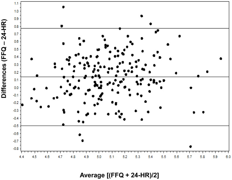
Figure 3. Bland Altman plot analysis of carbohydrate intake.
The Y axis is the difference between log-transformed data of carbohydrate intake measured by FFQ (average of FFQ1 and FFQ2) and 24-HRs (average of the four 24-HRs). The × axis is the mean carbohydrate intake of the two methods. The central solid horizontal line indicates the mean difference between the two methods, and the solid lines above and below it indicate ±2SDs.

