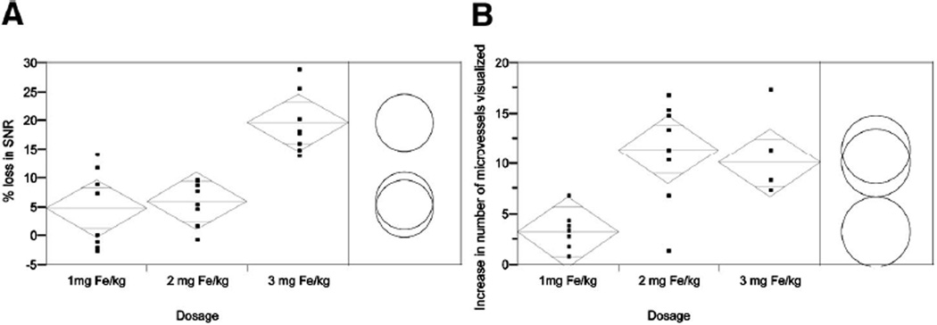
FIGURE 1.
Comparison of mean percentage SNR loss (A) and of mean difference in the number of microvessels visualized (B) among the 3 dosage groups. Standard error bars with upper and lower range limits set to 98.3% are reflected in the diamonds. Circles represent the range in each dosage group using the Student t test with α = 0.0167 for Bonferroni correction. Separation between circles thus reflects a significant difference.

