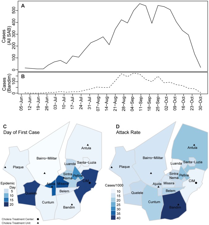
Figure 1. The 2008 cholera epidemic in SAB.
Panel A (solid line) shows suspected and confirmed cholera cases reporting to cholera treatment centers/units (shown as circles and triangles) throughout all areas of SAB aggregated in 5-day intervals. The dashed line below (B) shows 5-day aggregated cases from Bandim, the area with the highest attack rate (40.6 per 1000). Panel C illustrates the day of the first reported case for each area. Attack rates (per 1000) for each area are shown in D.

