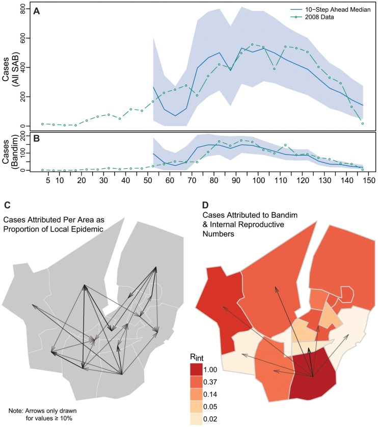
Figure 2. Cholera transmission model overview.
10-step ahead (50 day) predictions for all of SAB (A) and Bandim (B) with 95% predictive interval bands. The arrows in Panel C illustrate the proportion of cases estimated to be caused in each area (head of arrow) by another (tail end of arrow). Panel D illustrates the mean effective internal reproductive number ( for each area (colors), and the proportion of each areas epidemic estimated to be caused by Bandim (arrows). Arrow size and transparency are scaled by the magnitude with a minimum of 10% shown.

