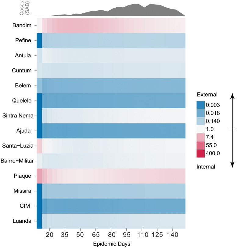
Figure 3. Odds of internally caused case over time by area.
Odds of a case being caused internally (i.e. as a result of other cases in that area) vs. externally for all areas throughout the epidemic, sorted by attack rate (top to bottom). Red represents those values in support of an internally driven epidemic and blue represents those supporting an externally driven epidemic. The observed epidemic curve is shown above in grey for reference.

