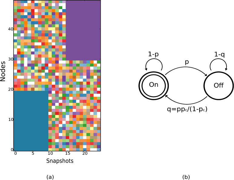
Figure 3. (a) An example of ground truth temporal communities that are used to generate evolving synthetic networks according to the markovian evolution shown in (b) and explained below.
We use an impressionistic visualization to show the temporal communities, that we refer to as the evolution chart, in which nodes are shown along the Y axis and the snapshot number along the X axis. Each “pixel” in the evolution chart corresponds to a particular node at a given time, and the color represents the community of that node at that time t. The left panel shows a network consisting of n = 50 nodes with two temporal communities consisting of 20 nodes each. The first community arises from the markovian evolution of nodes 0 – 19 over the first 10 snapshots, while the second arises from the markovian evolution of nodes 30 – 49 over the last 10 snapshots. (b) Schematic of Markovian evolution for intra-community edges, where an edge that exists in the current snapshot disappears with probability p in the subsequent snapshot, while a non-existing edge appears with probability q which is chosen such that the group density pc is preserved.

