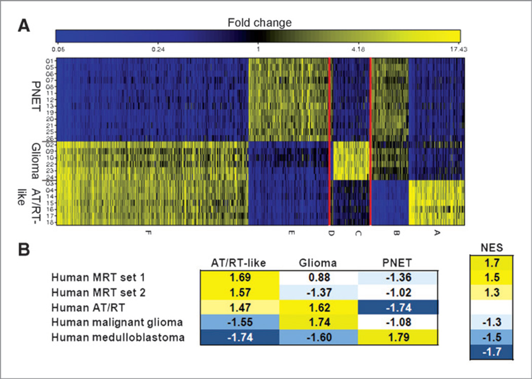
Figure 5.
Gene groups representing the 3 different tumor types. A, color coded relative gene expression differences of the 1,000 genes with maximum expression correlation to the 3 tumor types: Higher (yellow) and lower (blue) expression levels. Genes are plotted along the x-axis, tumor types along the y-axis. Six groups of genes were identified (A–F) with the highest correlation to one of the 3 tumor types. B, GSEA. A color-coded heatmap showing the enrichment of human brain tumor gene sets in the comparative gene expression data of the respective murine tumor types is depicted. Each tumor type was analyzed in comparison with the other two. The NES and color code indicate the degree of enrichment. High positive NES, confirming an enrichment, are shown in yellow; negative NES (blue) indicate that the human gene set is not enriched in the analyzed murine tumor type, but rather in the control group (i.e., the respective other 2 murine tumor types). Gene sets are listed in Supplementary File S1.

