
Fig. 7.
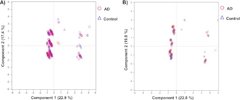
A principal component analysis plot of the ApoE (A) and ApoE4 (B) concentration data sets, showing healthy control samples (blue triangles) and AD cohort samples (red circles) for ε3ε3 (A) and ε3ε4 (B) genotypes.
Official websites use .gov
A
.gov website belongs to an official
government organization in the United States.
Secure .gov websites use HTTPS
A lock (
) or https:// means you've safely
connected to the .gov website. Share sensitive
information only on official, secure websites.
A principal component analysis plot of the ApoE (A) and ApoE4 (B) concentration data sets, showing healthy control samples (blue triangles) and AD cohort samples (red circles) for ε3ε3 (A) and ε3ε4 (B) genotypes.