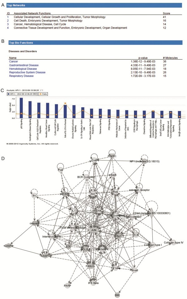
Figure 4.
Ingenuity Pathways Analysis (IPA) summary. (A) The list of top four networks with their respective scores obtained from IPA. (B) The list of top five bio functions with their respective scores obtained from IPA. (C) Toxicology pathway list in IPA analysis. The x-axis represents the top toxicology functions as calculated by IPA based on differentially expressed genes are highlighted and the y-axis represents the ratio of number of genes from the dataset that map to the pathway and the number of all known genes ascribed to the pathway. The yellow line represents the threshold of p value, 0.05 as calculated by Fischer’s test. (D) Most highly rated network in IPA analysis. The network representation of the most highly rated network. The genes that are shaded were determined to be significant from the statistical analysis. A solid line represents a direct interaction between the two gene products and a dotted line means there is an indirect interaction.

