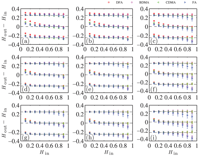
Figure 3. Impacts of the scaling range on the Hurst index estimates.
Each plot has a different scaling range [sleft, sright], where sleft = 4, 10, 20 from left column to right column and sright = 999, 1992, 5000 from top row to bottom row. In each plot, there are three clusters of curves. Each cluster corresponds to the three generators (FGN-DH, FBM-RMD and WFBM from top to bottom). The top and bottom clusters have been shifted vertically by +0.25 and −0.25 respectively for better visibility. In each clusters, there are four sets of points with their error bars that are obtained from four different analysis methods (FA, BDMA, CDMA and DFA). Each point shows the average slope of the Hurst index estimates over 100 simulated time series. The error bars show the standard deviations.

