
Fig. 4.
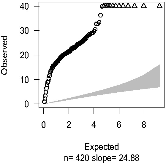
Q–Q plots were drawn by plotting observed  values against expected quantiles in
  distribution with df = 1 based on Williams’ extra-binomial model (EB1). The triangles in the charts stand for the SNPs with extremely large
  values beyond the boundary shown in vertical axis