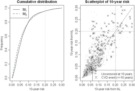
Figure 1.

LEFT: the cumulative distribution of the 10-year CVD risk across all the data used in the main analysis as predicted by each model. RIGHT: Scatter plot of predicted 10-year risk (only a randomly selected 5% of the data is plotted). The data points highlighted in black correspond to individuals who experienced a CVD events within 10 years of follow-up, grey points indicate all others (individuals with no events before 10 years or censored). The dashed vertical and horizontal lines point to the 20% risk threshold. The dashed diagonal corresponds to the theoretical line of perfect correlation.
